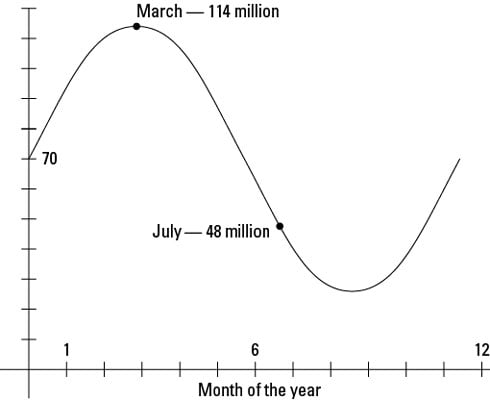
You can use the graph of the trig function to display the sales amounts over a certain period of time. Here’s an example: Although people in many parts of the world play soccer all year round, certain times of the year show an increase in outdoor soccer shoe sales. This is a shoe pair sales model where N is in millions of pairs and m is the month of the year: N (m) = 44 sin (0.524m) + 70.
From the equation, you can see that the average number of pairs sold is 70 million, which is the vertical shift to the top. This number fluctuates between 26 million and 114 million, and you can find it by adding and subtracting the amplitude 44 from the mean. period of this model

or 12 months. The following figure shows a graph of this function.